The Ultimate Guide to Designing App Store Screenshots

App store screenshots are one of the most important elements for app discoverability and conversion. With over 5 million apps on the App Store alone, standing out from the competition is critical. Most users decide whether to download an app or not based on the screenshots and descriptions shown on the app store page.
Great screenshots visually communicate your app's key features, value proposition, and overall user experience. They serve as your "first impression" to potential users browsing the store. Screenshots can make or break your conversions, ratings, and reviews.
Other Swiftspeed Users also read: 11 Best Email Clients for Windows and Mac in 2024
In this guide, we'll cover app store screenshot best practices to help you create compelling images that persuade users to download your app. We'll look at common mistakes to avoid, how to optimize images for legibility, writing effective descriptions, localization tips, A/B testing screenshots, and monitoring performance. Follow these app store screenshot strategies to increase downloads, improve rankings, and boost your app's success.
Let's dive in!
The Ultimate Guide to Designing App Store Screenshots

App Store screenshots are one of the most important elements for driving downloads and conveying what your app is about. More than any other asset, screenshots give potential users a quick visual representation of your app's user interface and value proposition.
Well-designed and optimized screenshots can entice people to learn more about your app and ultimately convince them to download it. The imagery allows you to showcase your app's functionality and standout features. It provides a snapshot of the user experience and gives people a feel for what using your app will be like.
Effective screenshots highlight the most important aspects of your app - the core functionality and value it provides. They should focus on what makes your app useful, easy to use, and better than the competition. The goal is to visually communicate how your app will solve a problem or fulfill a need for your target audience.
Great screenshots pique curiosity, spur interest, and drive action. They convey the essence of the app visually and persuade people to download it. Optimizing your screenshots is crucial for App Store visibility and conversion.
Best Practices
Creating effective App Store screenshots is crucial for conveying the value of your app and driving downloads. Here are some best practices to follow:
- Highlight core features/value prop - Focus on showcasing the most important features and functionality that make your app useful. For example, a fitness app may want to highlight workout-tracking capabilities.
- Demonstrate typical user workflows - Don't just show static screens. Use screenshots to guide users through key workflows to demonstrate how the app is used.
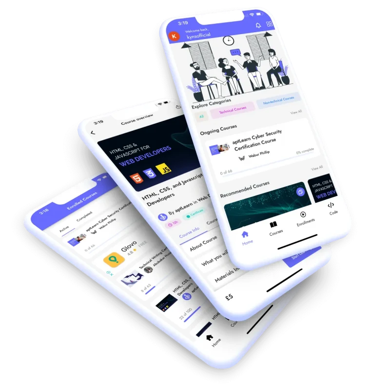
- Use appropriate device frames - Screenshots should be framed in iPhone or iPad bezels to clearly showcase the app experience. Avoid generic device mockups.
- Ensure readability - Images should use high resolution and be optimized for legibility. Text and interface elements should be clearly visible. Avoid cluttered interfaces.
- Use relevant imagery - Incorporate images of people using the app for relatable context when appropriate. Stock photos should match the app's brand and style.
- Highlight key differentiators - If your app has innovative features that competitors lack, make sure to emphasize those unique capabilities.
- Localize screenshots - Adapt screenshots for each localized app store listing to include relevant language and locale-specific content.
- Less is more - Stick to the most important 5-10 screenshots that sell the app. Avoid including too many or repetitive images.
By focusing screenshots on the most compelling features and visuals that communicate real value, you can create effective App Store assets to maximize conversions.
Requirements and Guidelines for App Store Screenshots
Realistically, you don't want to spend hours creating masterpiece images only to find out it doesn't meet the App Store's technical requirements. So, let's dive into what Apple and Google expect from your screenshots.
Apple App Store:
File Format and Dimensions
Apple is quite specific about the file formats it accepts for App Store Screenshots. You'll need to submit your screenshots in JPEG format; they somehow do not accept PNG; at least, it did not work the last time we tried to upload a PNG. But that's not all; Apple also has particular dimensions for different devices. For instance:
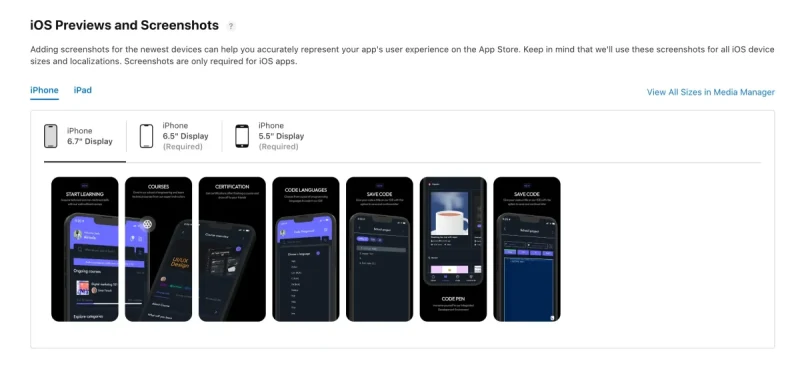
- iPhones: For the latest iPhone models, you'll need screenshots with dimensions of 1284 x 2778 pixels for portrait and 2778 x 1284 pixels for landscape.
- iPads: For iPads, the dimensions are 2048 x 2732 pixels for portrait and 2732 x 2048 pixels for landscape. See our in-depth article on iPhone Screen Resolution and Sizes for more information.
👉🏾 See Also: Comprehensive Guide on Phone Screen Resolution and Sizes
Compliance Guidelines
Apple has a stringent review process, and non-compliance with their guidelines could result in your app being rejected. Some key points to remember are:
- Content: Ensure that the screenshots are free from explicit content, hate speech, or anything that violates Apple's content policies.
- Clarity: The screenshots should clearly represent the app's functionality and should not be misleading.
- Quality: Apple expects high-quality retina display screenshots.

Google Play Store
- File Format and Dimensions
Google is a bit more flexible than Apple regarding file formats. The Play Store accepts JPEG and 24-bit PNG (no alpha). The dimensions can increase to a maximum of 3840 x 2160 pixels for landscape and 2160 x 3840 pixels for portrait.
- Compliance Guidelines
Google also has its own set of rules and guidelines:
- Content: Like Apple, Google prohibits explicit content and anything that violates its content policies.
- Localization: If your app is available in multiple languages, Google encourages you to include localized screenshots.
- Quality: While Google is less stringent than Apple, it still expects good-quality screenshots.
Why Adhering to App Store Screenshot Guidelines is Crucial
Apple and Google have these guidelines to ensure a uniform, high-quality user experience. Non-compliance doesn't just risk app rejection; it also impacts how users perceive your app. A low-quality screenshot can turn potential users away. No matter how great your app is, users won't know if they have never tried it.
You also would not want to waste your time and effort.
Choosing the Right Screenshot Styles
Now that we've got the technical stuff out, let's get to the fun part— choosing the right screenshot style. Let's explore some popular styles that can elevate your App Store Screenshots.
TIP: For inspirational purposes on how your screenshot should look, you can check existing successful apps on Google Play or the Apple App Store, You can also check product design websites like Dribble or Behance. You will find different existing inspirational projects that you can closely emulate, as long as you try to add your own creativity, stand unique, and stand out, your app will get the attention it deserves.
Classic Style
This style is about showcasing your app's interface in the most straightforward manner possible. There are no frills or distractions—just your app's glory.
Why Choose Classic Style?
- It's universally understood and appreciated.
- It gives a clear, unobstructed view of your app's interface.
- It's excellent for apps that are so intuitive they speak for themselves.
Solid Color and Device
This style is for those who swear by the mantra, "Less is more." A solid background color with your app neatly framed within a device. It's clean, it's simple, and it screams usability.
Why Choose Solid Color and Device?
- It highlights the app's simplicity and ease of use.
- The solid background minimizes distractions, focusing the user's attention solely on the app.
- It's perfect for utility apps that prioritize function over form.
Blurred Background and Device: Depth and Focus
Imagine your app framed within a device set against a blurred background. This style creates a sense of depth, making your app the focal point.
Why Choose Blurred Background and Device?
- It creates a sense of depth and immersion.
- It's excellent for apps highlighting a specific feature or function.
- It adds a touch of sophistication to your screenshots.
Tutorials: The Step-by-Step Guide
Does your app have a learning curve? Is it feature-rich with functionalities that need a bit of explaining? Well, the Tutorial style is your best bet.

Why Choose Tutorials?
- It's incredibly effective for apps that require some level of user education.
- It provides a step-by-step guide, making the app more accessible to new users.
- It can significantly reduce the user's learning curve, encouraging more downloads.
Other Swiftspeed Users also read App Name Detailed Guidelines and Best Practices for Success
Storytelling Through App Store Screenshots
Think about your favourite stories for a moment. What makes them so captivating? Is it the characters, the plot twists, or perhaps the emotional journey? What if I told you that your app could be the protagonist of its own compelling narrative? A narrative that not only captures attention but also converts interest into downloads.
Why Use Storytelling in Screenshots?
- It makes your app memorable and relatable.
- It provides context, helping users understand how the app fits into their lives.
- It engages the user emotionally, making them more likely to take action.
Incorporating Storytelling Elements in Screenshots
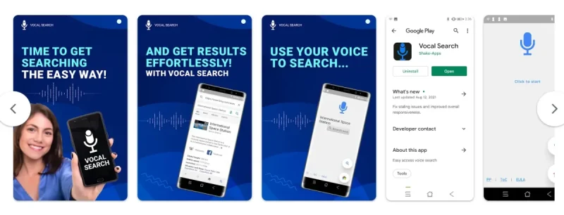
So, how do you go about weaving this narrative? Simple. Use a sequence of screenshots to tell a mini-story. Start with a problem that your potential user might be facing.
Maybe they're struggling to keep track of their expenses, or perhaps they're looking for a quick and healthy recipe. Then, introduce your app as the hero that comes to the rescue. Show how effortlessly your app solves this problem. Finally, it ends with a happy user whose life has been made easier or better thanks to your app.
How to Craft the Perfect Story Sequence?
- Identify the problem or need that your app addresses.
- Showcase how your app is the solution to that problem.
- Highlight the positive outcome or benefit the user will experience.
Highlighting Key Features and Benefits Through Narratives
You can also use storytelling to highlight your app's key features and benefits. Instead of just listing them out, integrate them into your narrative. For example, if one of your app's features is a built-in calorie counter, show it in action within the context of a larger story—perhaps someone achieving their fitness goals using your app.
Why Integrate Features into the Story?
- It showcases the practical applications of your app's features.
- It provides a more engaging and informative experience for the user.
- It sets your app apart from competitors who may be using more traditional, less engaging screenshot styles.
So, the next time you're working on your app store screenshots, think about the story you want to tell. A well-crafted narrative could be the difference between a user scrolling past your app and one who's captivated enough to hit that download button. And let's be honest, who doesn't love a good story?
Design Principles for Effective App Store Screenshots
Designing App Store screenshots that capture attention and convert is not exactly an easy task to achieve; it's rigorous work but worth it in the end. But fret not because we are about to share the most important design principles for creating screenshots that are nothing short of captivating.
- Rule of Thirds for Visual Composition
Let's start with a classic: the Rule of Thirds. Imagine your screenshot is divided into nine equal rectangles, three across and three down. According to this principle, the most crucial elements—whether it's a text, an icon, or a feature—should be placed along these lines or at their intersections.
Why Does This Matter?
- It creates balance, making your screenshot more aesthetically pleasing.
- It draws the eye to the most important elements, increasing the likelihood of engagement.
2. Effective Use of Color and Contrast
Colors are not just decorative elements; they're emotional triggers. A well-chosen color scheme can set the mood, highlight your app's key features, and even influence user behavior. For instance, a calming blue might be perfect for a meditation app, while a vibrant red and yellow could make a food delivery app more enticing.
How to Nail the Color Scheme?
- Use colours that align with your brand's identity.
- Make sure there's enough contrast between text and background for better readability.
3. Feature Order and Hierarchy
You've got about 2-3 seconds to impress a potential user as they scroll through the App Store. Make it count by presenting your most compelling features first. Arrange your screenshots in a way that the first one solves a problem or fulfils a need for your potential users.
Why is the Order Important?
- It immediately addresses the user's primary need or problem.
- It sets the tone for what the user can expect from the rest of your app.
4. Typography and Legibility
The text in your screenshots is not just informational; it's also a design element. Choose fonts that are not only easy to read but also align with your brand's personality. Whether it's bold and modern or elegant and sophisticated, the right typography can make or break your design.
Typography Best Practices:
- Keep it legible. Your text should be easy to read, even on smaller screens.
- Limit the number of different fonts to maintain a cohesive look.
5. Creating a Cohesive and Visually Appealing Design
Last but not least, consistency is your best friend. All your screenshots should look like they belong to the same family. This doesn't mean they should be identical, but they should share common design elements like color schemes, fonts, and layouts.
Why is Cohesion Important?
- It creates a unified brand image.
- It makes your app appear more professional and trustworthy.
Optimizing Images
App store screenshots are visual representations of your app. They give users a glimpse into your app's user interface and experience. Therefore, optimized images are essential for making a great first impression.
When creating screenshots, keep these tips in mind:
- Use a template editor to add custom frames, backgrounds, and device mockups. This elevates your screenshots with a professional, polished look. Avoid cluttered backgrounds that distract from your app.
- Ensure images are high resolution with sharp image quality. Do not scale up low res screenshots, as they will appear pixelated. Export screenshots at the recommended sizes for each app store.
- Use compressed image formats like JPEG and PNG to reduce file size without sacrificing quality. JPEG is best for photos, while PNG is better for images with flat colors and text.
- Follow size guidelines for each app store. Apple requires at least one screenshot to be 12.9-inch x 2732 pixels. Google Play recommends 1080 x 1920 pixels. Creating screenshots at higher resolutions will enable scaling down for different requirements.
With well-optimized images, you can highlight your app's best features and convince users to download. Invest time in taking great screenshots that do justice to your hard work developing the app. Images are your sales pitch - don't neglect their importance.
Use Swiftspeed App Builder - Build App Faster
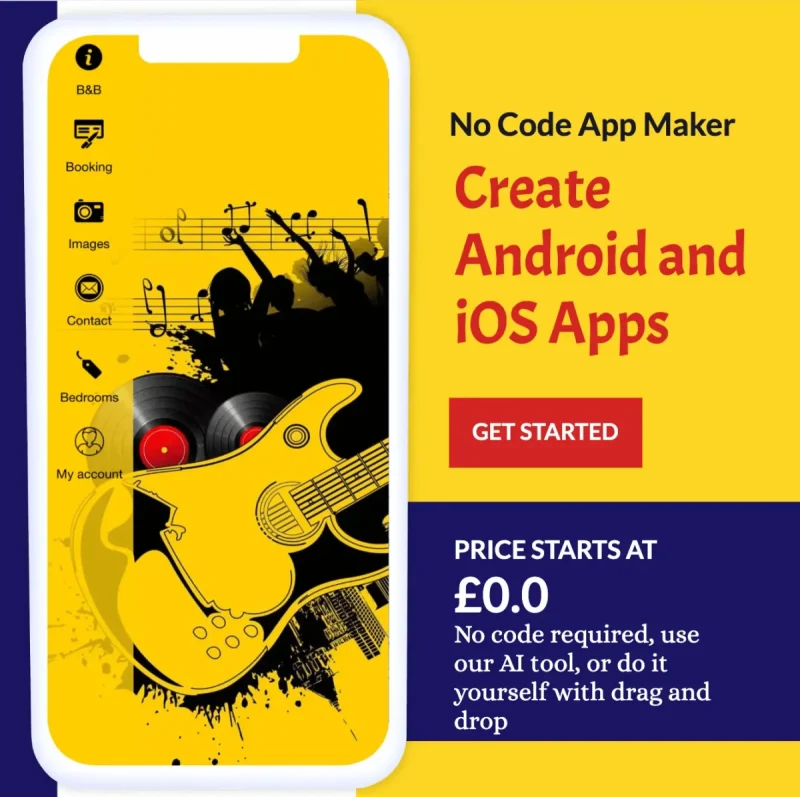
If you're looking to create an iOS app, Android app, or even a Mobile Game that not only functions seamlessly but also looks stunning, Swiftspeed is your go-to platform. Known as the best iPhone app builder, Swiftspeed takes the complexity out of app development and design, allowing you to focus on what really matters—delivering an exceptional user experience.
With Swiftspeed, you can effortlessly adhere to all the App Store screenshot guidelines we've discussed, ensuring your app not only meets but exceeds Apple's stringent standards.
Make an app with Swiftspeed Appcreator
Create premium apps without writing a single line of code, thanks to our user-friendly app builder. Build an app for your website or business with ease.
What sets Swiftspeed apart is its commitment to empowering businesses and individuals to bring their app visions to life without the need for coding.
Our App Maker offers many customization options, allowing you to design App Store Screenshots that truly resonate with your target audience. From A/B testing features to localization options, Swiftspeed provides a comprehensive toolkit for optimizing your app's visibility and download rates.
So why settle for less when you can have the best? Buy Swiftspeed App Store Screenshots services and let us create a visual treat that users can't resist.
Optimizing App Store Screenshots for Increased Downloads
Let's discuss the store optimization strategies that can help increase your app installs on the app stores.
2. Use A/B Testing to Determine the Most Effective Screenshots
A/B testing isn't just a one-time thing; it's an ongoing process. Start by creating two different sets of screenshots. Version A could highlight your app's ease of use, while Version B might focus on its advanced features. Run these versions simultaneously and analyze the download metrics to see which one performs better.
How to Run an Effective A/B Test:
- Use a reliable A/B testing tool that integrates well with the App Store.
- Run the test for a sufficient amount of time to gather actionable data.
- Analyze the results and implement the winning elements in your final screenshots.
3. Localization for Targeting Specific Markets
If your app is a global player, one size doesn't fit all. What works in the U.S. might not necessarily work in Japan. Localizing your App Store Screenshots can give you a significant edge in non-English speaking markets.
Why Localize?
- It involves adapting cultural nuances, like colour symbolism, to resonate with a specific audience.
- It can significantly boost your app's visibility and credibility in local App Stores.
- Hire native speakers or localization experts to ensure accuracy and cultural relevance.
- Test localized screenshots through A/B testing to gauge their effectiveness.
With these optimization strategies in your arsenal, you're not just throwing screenshots into the App Store and hoping for the best. You're making data-driven, strategic decisions that could significantly increase your app's download rates. So go ahead, optimize away, and watch those download numbers soar!
Other Swiftspeed Users also read: Complete list of top mobile app stores in 2024
Best Tools for Creating App Store Screenshots
Creating App Store Screenshots that are both visually stunning and effective is not difficult with the right tool. There are sophisticated design tools devised to make this process as smooth as possible. Let's explore some of the best tools that can help you create screenshots that will make users stop scrolling and start downloading your app.
1. Placeit
Placeit is a fantastic online tool that offers a surfeit of templates designed specifically for App Store Screenshots. With its user-friendly interface, you can customize your screenshots to align perfectly with your brand's aesthetic. The best part? No design skills are required.
- Visit: Placeit
2. Screenshot Pro
If you're looking for something that offers a bit more control, Screenshot Pro is your go-to. This desktop application allows for intricate customization, giving you the freedom to tweak every little detail until it's just right.
- Visit: Screenshot Pro
3. Promotee
Exclusively for Mac users, Promotee offers a range of easy-to-use templates that make the screenshot creation process a breeze. It's perfect for those who want a quick, straightforward solution without compromising on quality.
- Visit: Promotee
4. Adobe Photoshop
This tool offers endless possibilities but comes with a steep learning curve. If you're already proficient in Photoshop, the sky's the limit when it comes to designing your App Store Screenshots.
- Visit: Adobe Photoshop
5. Pixeltrue Mockup
Last but definitely not least, Pixeltrue Mockup offers a range of stunning, high-quality mockups that can elevate your App Store Screenshots to a whole new level. With its easy-to-use interface, you can create professional-looking screenshots that are sure to captivate your audience.
- Hyperlink: Pixeltrue Mockup
Choosing the right tool can make a world of difference in how your App Store Screenshots turn out. Whether you're a design novice or a seasoned pro, these tools offer something for everyone. So go ahead, pick your weapon of choice, and start crafting those eye-catching, download-inducing App Store Screenshots.
Let's Wrap it up
Remember, the journey doesn't end here. Keep testing, optimizing, and most importantly, listening to your users. Their feedback is the most authentic yardstick of your app's success.
So go ahead, and get creative with your app screenshot, and let it be the compelling visual story that sets your app apart in an already crowded app marketplace. Whether you're a seasoned developer or a newbie just dipping your toes in mobile app development, the principles and strategies outlined here are your stepping stones to skyrocketing downloads and stellar user engagement
FAQs (Frequently Asked Questions)
Frequently asked questions on App Store Screenshots by our users
Q: Why are App Store Screenshots important for app promotion?
Ans: Well-designed screenshots don't just catch the eye; they tell a story, showcase your app's unique features, and offer a promise of what's inside. In short, they can significantly boost your app's download rates and overall user engagement.
Q: What are the technical requirements for App Store Screenshots?
Ans: Both the Apple App Store and Google Play Store have their own sets of rules. For the Apple App Store, you'll need to submit your screenshots in JPEG or PNG format, with dimensions that vary depending on the device. Google Play Store also accepts JPEG and 24-bit PNG (no alpha), but they have their own set of dimension requirements. Non-compliance is not an option; failing to meet these requirements could result in your app being rejected. In fact, more likely.
Q: How can I choose the right screenshot style for my app?
Ans: The style of your screenshots should align with your app's core features and the message you want to convey. It's not a one--all situation. You can use A/B testing to experiment with different styles and gauge which ones resonate most with your target audience.
Q: What are some design principles to consider when creating App Store Screenshots?
Ans: Designing screenshots requires a keen eye for detail. Key principles to keep in mind include the rule of thirds for visual composition, effective use of color and contrast to evoke the right emotions and typography that complements your design while being legible.
Q: How can I optimize my App Store Screenshots for increased downloads?
Ans: Once you've designed your screenshots, the next step is optimization. This involves A/B testing to identify which screenshots are most effective, localizing your screenshots for different markets, and highlighting the unique features that set your app apart from the competition.
Q: What are some recommended tools for creating App Store Screenshots?
Ans: There are several tools designed to make your life easier, we have already mentioned them in the article and they include but are not limited to Placeit, Screenshot Maker Pro, Promotee, Adobe Photoshop, Figma, and Pixeltrue Mockup. Each has its own set of features and benefits, so choose the one that best suits your needs.
Q: What is the step-by-step process for creating compelling App Store Screenshots?
Ans: The journey to creating killer screenshots involves several steps. Start with planning—decide what features you want to highlight and how. Then, move on to the design phase, where you'll create the screenshots and add any text overlays. Finally, review and optimize your screenshots, making use of A/B testing and other optimization strategies.
There you have it, our comprehensive guide on designing App Store Screenshots that look good and convert downloads. Do you need to ask more questions? Feel free to drop them in the comments below.
