Custom Page (CMS) Feature
What is the Custom Page feature?
Custom Page is a block-based content builder that turns part of your mobile app into a mini CMS. You stack blocks (text, image, gallery, slider, video, podcast audio, address, button, checklist, file download, inline source code) and the native app renders them as a polished mobile page.
It is where you ship anything the dedicated features do not cover: a brand story, a seasonal menu, an FAQ, a promo landing page, a how-to, your privacy policy or terms. One Custom Page feature can hold many pages, and you choose how they are presented, from a simple single page to a swipeable story reel.
Adding the feature to your app
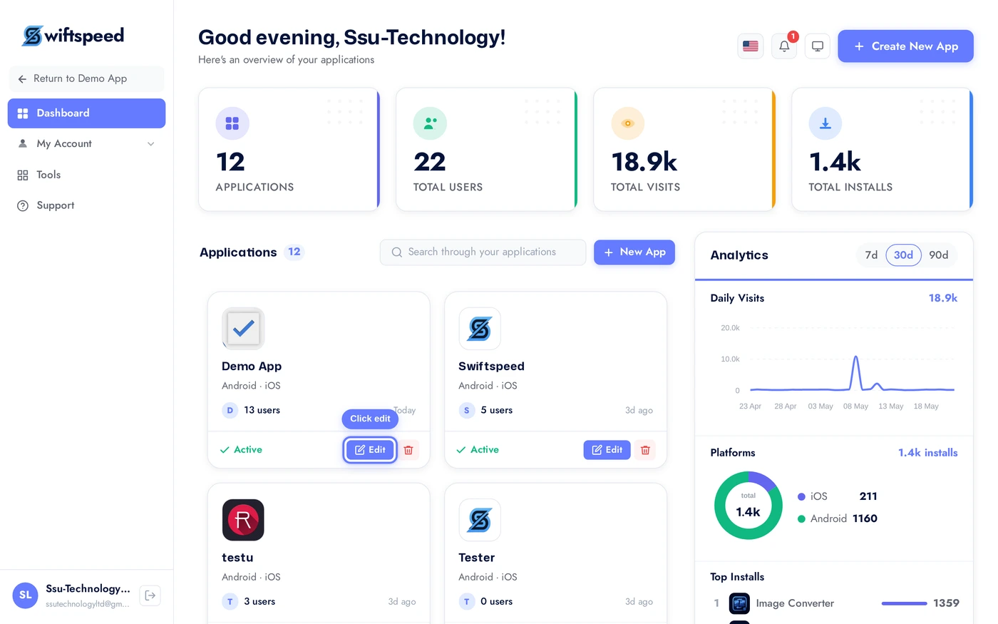
From your dashboard, click the edit pencil on the app you want to add content pages to.
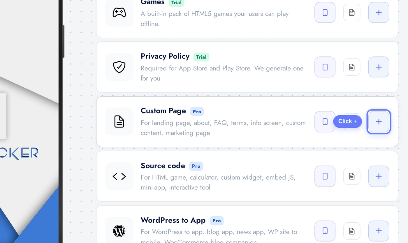
Open Features, find the Custom Page card, and click the + to add it. The CMS feature is now on your app, ready to build.
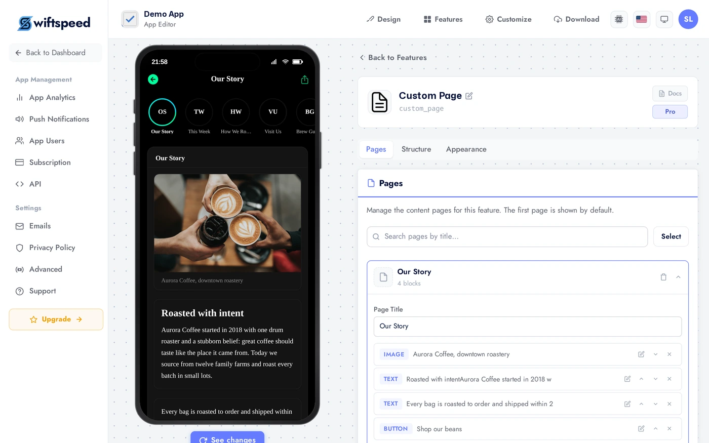
The editor: three tabs
The Custom Page editor is organised into three tabs:
The Pages tab. Each page is a row you can expand into its own block editor. Use + Add Block to stack content, drag the handle to reorder, and Save Page to publish. Our demo has five pages: Our Story, This Week, How We Roast, Visit Us, and Brew Guides.
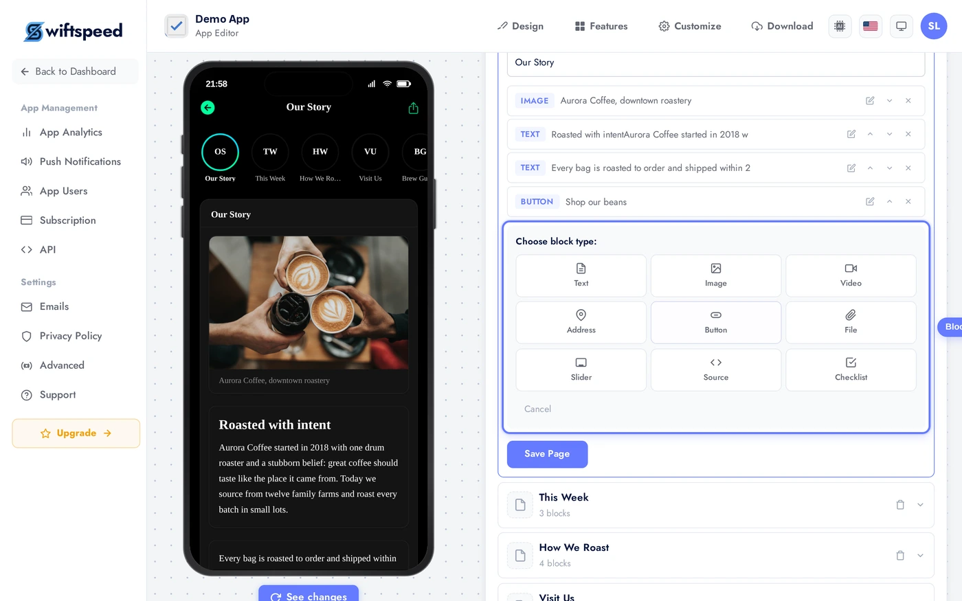
Clicking Add Block opens the block picker. Pick a type and an inline editor opens for it.
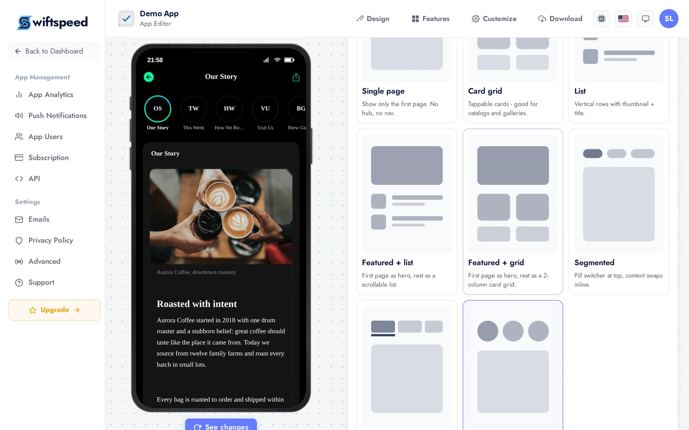
The Structure tab. We picked Story reel, which presents pages as tappable circles across the top, just like social stories. Other options include list, grid, featured, segments, and tabs.
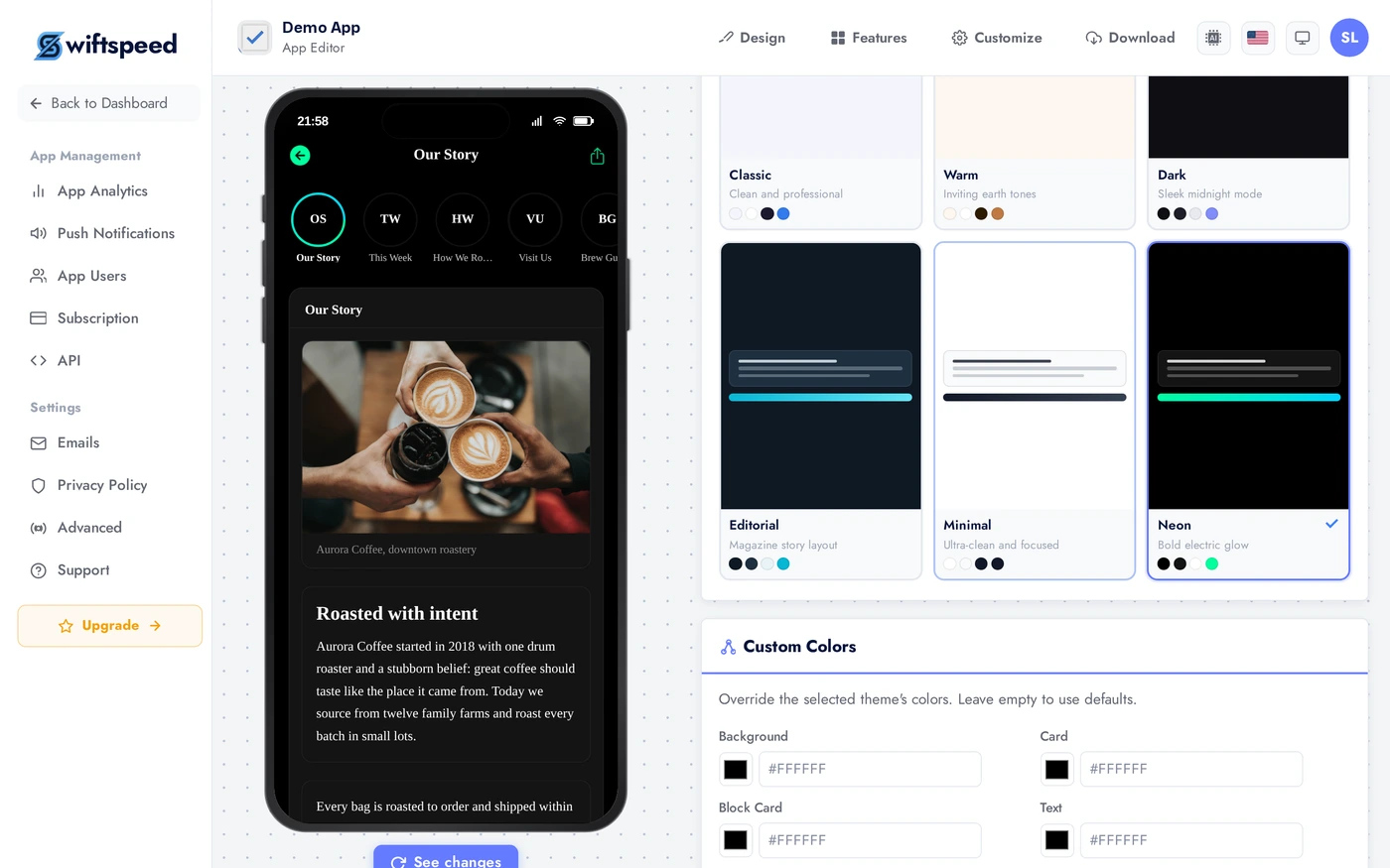
The Appearance tab. Each theme restyles every page in the feature. We chose Neon. You can also override individual colours.
- Pages is the main workspace: add pages, open each one, and stack content blocks inside it.
- Structure chooses how multiple pages are presented to your users (single, list, grid, featured, segments, tabs, or a story reel) and whether an account is required.
- Appearance picks the theme that styles every page in this feature, with optional custom colours.
Block types
Inside any page you stack blocks top to bottom. The available blocks:
- Text: rich paragraphs (headings, bold, italic, lists, links), optionally with an image to the side or above.
- Image: a single image with an optional caption.
- Slider: a swipeable image carousel, each slide with its own caption.
- Video (YouTube): paste any YouTube link, the page embeds the player. Plays even for users without a YouTube account.
- Video (direct URL): a hosted video file (mp4 etc.) in a native player.
- Podcast (audio): an audio episode that plays through the same native engine as the Audio and Radio features, with lock-screen controls, background play, and a mini player.
- Address: shows the address, phone, and website, plus a modern Get Directions button that opens Google Maps, Apple Maps, or any link you paste.
- Button: a call-to-action that opens a link, dials a number, or starts an email.
- Checklist: a tickable list that remembers what each user checked (on the device, or synced to their account when you require sign-in).
- File / Download: a downloadable file (PDF, ZIP, and so on) that saves natively to the device.
- Source code (HTML): arbitrary HTML/CSS/JS embedded inline as one block.
Reorder blocks by dragging the handle on the left of each row. Every block has its own inline editor that opens when you click into it.
Live preview
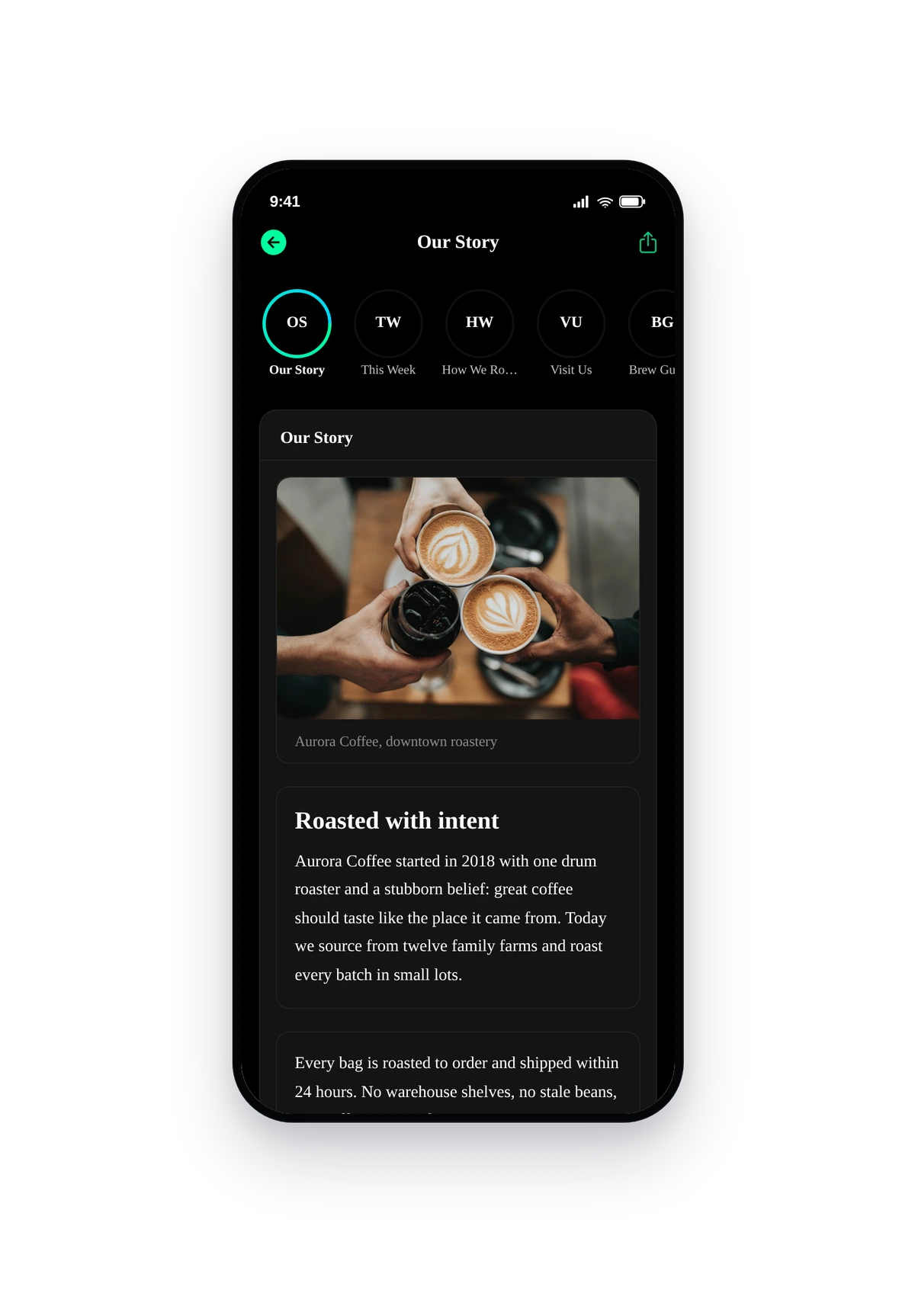
Here is the seeded demo rendered inside a real phone: the Neon theme with the Story-reel layout. The circles across the top are the five pages, and the active story renders below.
The native story reel. Tap any circle to switch pages; each page scrolls its own stack of blocks. This is exactly what your users see, your own pages simply replace the demo content.
Choosing a layout
The Structure tab decides how multiple pages are presented. Match it to the kind of content you publish:
- Single page: shows only the first page, no hub. Best for one standalone page (a policy, an About).
- List: vertical rows with a thumbnail and title. Best for many text-led pages, like an FAQ or article index.
- Card grid: tappable cards. Best for visual catalogues and galleries.
- Featured + list: the first page as a hero, the rest as a list below.
- Segments / Tabs: switch pages inline without leaving the screen. Best for a few closely related pages.
- Story reel: tappable circles across the top, social-stories style. Best for short, visual, frequently-updated pages, like our demo.
Tips and best practices
- Give each page a cover image. Story reel, grid, and featured layouts use it as the artwork; without one they fall back to a clean monogram.
- Image blocks: 1200px wide is the sweet spot. Bigger inflates load time with no visible gain on phones. JPG at 80-85 quality is usually indistinguishable.
- Slider images should share one aspect ratio. Mixing portrait and landscape in one slider makes the height jump on swipe.
- Paste YouTube links however you like. A full watch URL, a youtu.be short link, or a bare video id all work; the editor extracts the id for you.
- Podcasts get full native playback. Background play and lock-screen controls come for free because the block uses the same engine as the Audio feature.
- Address blocks build directions automatically. Leave the directions link blank and the Get Directions button routes from the coordinates, or the typed address.
- Checklists can require an account. Turn on "account required" in Structure if you want each user's ticks to sync across their devices instead of staying on one phone.
- Custom Pages are the right home for legal text. Privacy policy, terms, accessibility, the text block handles long-form content cleanly with no external hosting.