Customizing App Design and Typography
What is the Design Page?
The Design page is where you set the overall look of your mobile app. Three big choices and one fine-tuning surface:
- Template is the global visual style (modern, classic, bold, minimal, playful). Affects spacing, corner radii, shadows, animation, and the default typography. Pick the template that matches your audience.
- Layout is the home-page arrangement (tab bar, side menu, hero grid, dashboard cards, etc). Drives navigation patterns. The phone preview updates the moment you change layout.
- Layout options are template-and-layout-specific tweaks (number of cards in the hero, whether to show a search bar, etc). Available only for layouts that actually support each option.
- Colors (separate tab) is your palette: background, surface, text, accent, and tab bar colors.
Where to Find It
In the App editor, click Design in the top bar (or sidebar depending on layout). Two sub-tabs: Design (default, template / layout / options) and Colors (palette).
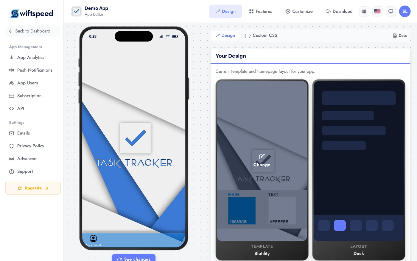
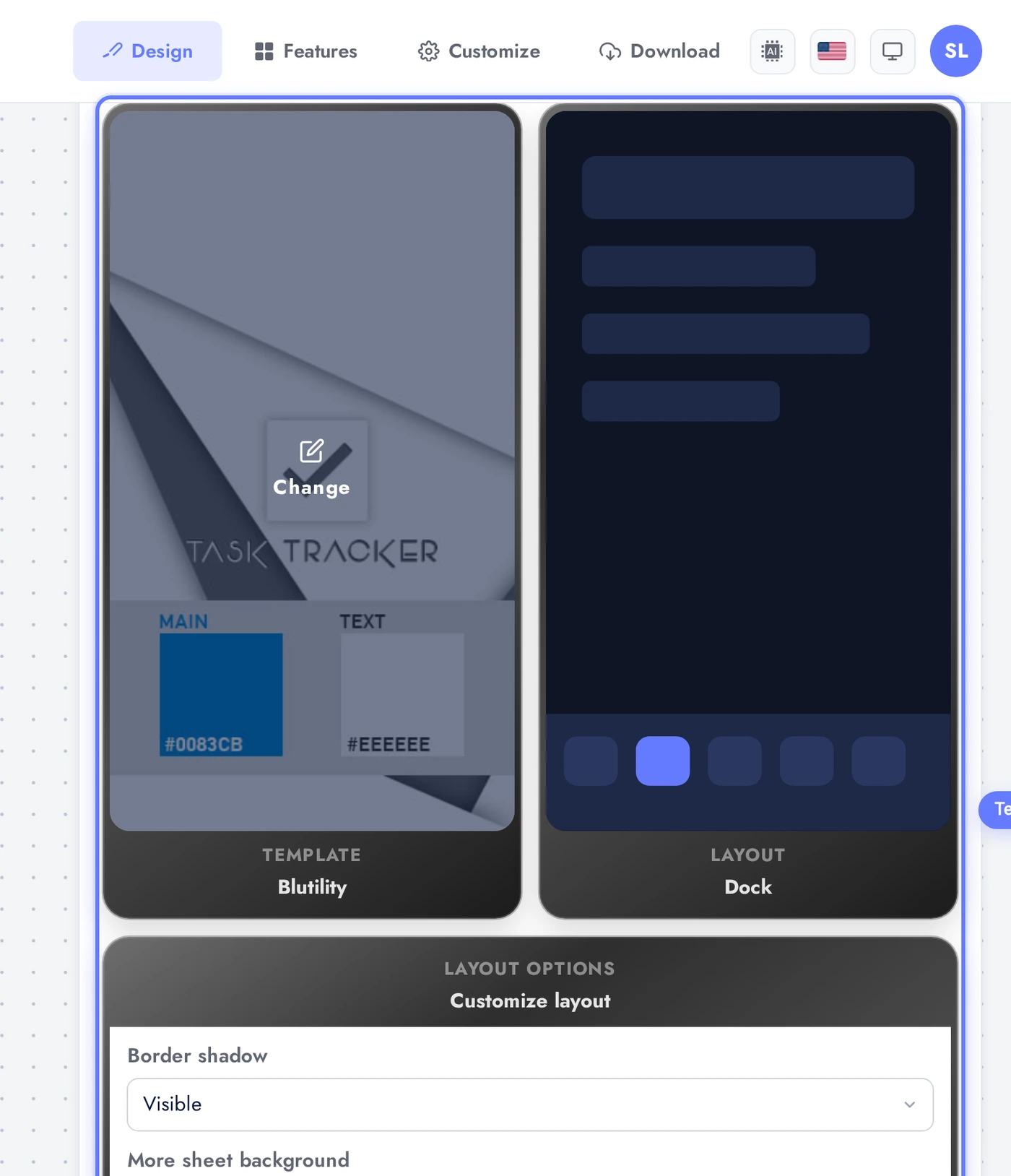
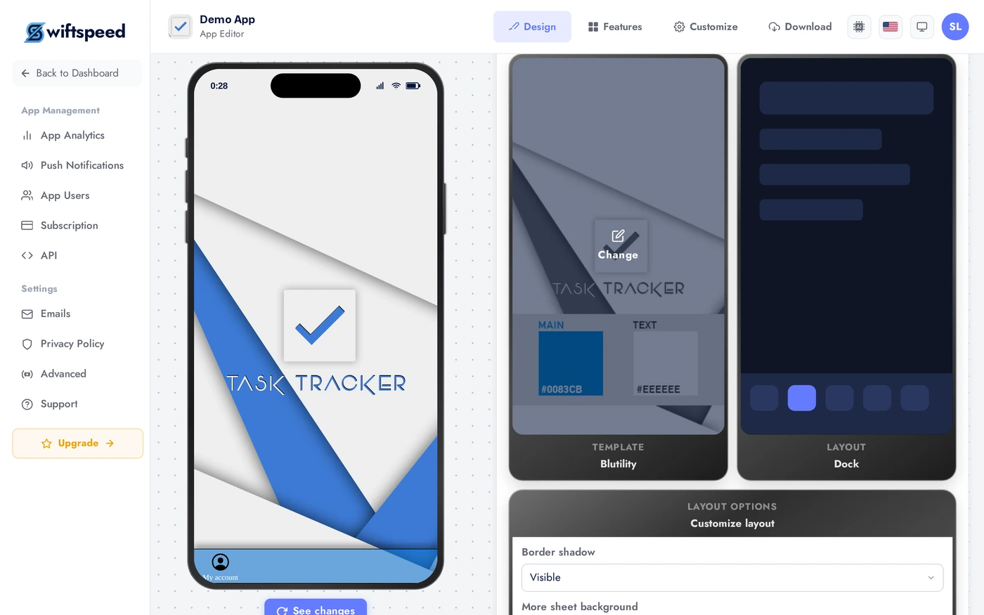
Design Tab: Template, Layout, Options
The Design tab is a row of three cards: Template (left), Layout (middle), Layout options (right). Click any of the first two thumbnails to open the picker modal and choose a new template or layout. The phone preview updates immediately. Layout options below show settings specific to your current layout (toggle features, set counts).
Colors Tab
Switch to the Colors sub-tab to set the brand palette. Pick from suggested palettes or tune individual colors: background, surface, text, accent, tab bar background, tab bar icon. Every change updates the phone preview live. See the Customizing App Colors article for the full color story.
Tips
- Pick the template first. It sets sensible defaults for everything else (typography, spacing, animations). Changing template later resets most layout options.
- Layout drives navigation pattern. Tab-bar layouts work for apps with 4 to 5 top-level destinations. Side-menu layouts work for apps with 10+ destinations. Dashboard layouts work for tool apps with one primary screen plus secondary actions.
- The phone preview is your source of truth. If something looks wrong in the preview, it will look wrong in the live app. Iterate in the preview before you ship.
- Mix templates and layouts deliberately. Modern template + tab-bar layout is the safest combo. Bold template + dashboard layout is striking but harder to navigate.
- Colors come last. Get the template and layout right, then tune colors against the live preview. Picking colors before structure usually means redoing them.